

Lies, Damned Lies, ... And Job Reports?

Perhaps that’s a bit unfair, because it appears that it’s entirely possible to glean useful information even from US job reports.
This morning, Zerohedge started with skepticism—like most of the rest of economic analysts:
The post itself is long and detailed, but the first paragraph is telling for what it says about the seat of the pants reaction of informed analysts:
With even permabull economists conceding that the US economy is slowing rapidly and today's payrolls report should show a big slowdown, moments ago the BLS confirmed yet again that the monthly payrolls number is nothing but a politically mandated homework assignment (where trends only change when someone gets a tap on the shoulder), when - at a time when US GDP is set to decline for two quarters in a row - it reported that in June US payrolls rose by 372K, smashing expectations of a 268K increase, coming well above the whisper number of 245K, and trouncing Goldman's preferred payrolls range of 175-250K.
However, with a bit of time to go through the numbers, Zerohedge returned with a new take that’s quite interesting. The jobs report actually points to a phenomenon that has been reported for a number of weeks, and is disturbing in what it says about the direction in which American society is headed. No wonder so many people are upset with that direction:
Something Snaps In The US Labor Market: Full, Part-Time Workers Plunge As Multiple Jobholders Soar
Again, this is a highly detailed post, but it’s also fairly easy to comprehend in its essentials.
Something odd emerges when looking at the June payrolls report.
On one hand, the closely followed establishment survey came in red hot, and despite dropping modestly from May, it still printed some 100K above the median consensus expectation, at 372K vs the median consensus of 268K...
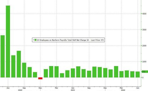
... and with wages in line with expectations, rising 0.3% M/M or 5.1% Y/Y, it was enough for many to conclude that calls of a recession are premature because, after all, you can't enter a recession when jobs are rising by almost 400K.
True... but a problem emerges when looking at the more detailed, if less closely watched, Household survey. Here, unlike the Establishment Survey, the June jobs change was actually a striking 315K drop, and after the April plunge of 353K, the June drop was actually the biggest going back to the March 2020 crash.
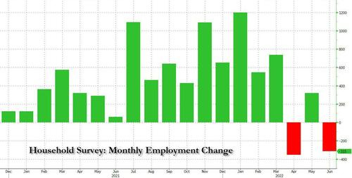
And since the Household survey also feeds other closely watched ratios, such as the labor force participation rate, it explains why despite the apparent "surge" in June jobs, the LFP declined and is now unchanged since January.

So what's going on here? Well, starting at the top, we find the following discrepancy:
Establishment Survey: +372K
Household Survey: -315K
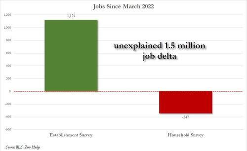
But things only get worse after that, because if one goes back a little more, one finds that something appears to have broken a few months ago, around March, when the Establishment Survey kept on rising unperturbed, while the Household Survey hit some unexplained brick wall, and hasn't moved at all.
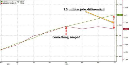
In fact, since March, the Establishment Survey shows a gain of 1.124 million jobs while the Household Survey shows an employment loss of 347K!
But wait, there's more, because digging in even deeper, we find that this drop in Household Survey employment is the result of both full-time and part-time jobs. In fact, as shown below, since March, the US has lost 70K full-time employees and 462K part-time employees.
The answer is relatively simple: More and more people are working multiple jobs—even multiple full time jobs! So, fewer people are working, but a record number of those working people are holding down multiple full time jobs. That is not a sign of economic health. Period.
Zerohedge concludes the post with this:
… the BLS data engineers have been busy goalseeking the Establishment Survey (perhaps with the occasional nudge from the White House) to make it appear as if the economy is growing strongly, when in reality all they are doing is applying the same erroneous seasonal adjustment factor that gave such a wrong perspective of the labor market in the aftermath of the covid pandemic (until it was all adjusted away a year ago). In other words, while the labor market is already cracking, it will take the BLS several months of veering away from reality before the government bureaucrats accept and admit what is truly taking place.
We expect that "realization" to take place just after the midterms, because the last thing the Biden administration can afford is admit the labor market is crashing in addition to the continued surge in inflation.
Karl Denninger, as usual, digs down for even more insight into what’s going on in American society, and his findings are disturbing. KD always attempts to get around the usual “adjustments” in BLS job reports and looks for the numbers that can’t be adjusted. I hasten to add that I haven’t seen KD be obviously wrong on virtually anything that I can think of when it comes to this type of analysis. So:
Here’s the nub of what he’s saying. There’s more—including a spreadsheet of data—and I urge numerate people to take a look for themselves. What he’s saying tends to confirm what the life insurance companies have also been saying:
The unadjusted number was +69,000 a 90% decline from the prior month.
In addition, and perhaps much worse, 700,000 people left the "not in labor force" number and came back into the workforce, so net-net most of them -- 90% -- didn't find jobs.
...
The "barbell" that we've had for a couple of decades is starting to flash red too -- among educational attainment the employment-population ratio for those with Bachelor's Degrees and better was down a massive 0.9% in one month and worse, it appears plenty of those people are dying too because 622,000 of them disappeared from the labor force last month and you can never go down in educational attainment, thus this is not migration from one category to another. …
In other words, once you attain the Bachelor’s Degree Or Better status, you can’t drop out of that category. The number is baked in. The only way to get out is to die. And the question then becomes—how do we explain a relatively sudden drop in a fundamental statistic like that? KD has said in the past that he thinks the drop is correlated to the Covid injections. Ed Dowd comes to a similar conclusion from his study of life insurance claims, which is interesting—you seem to have a correlation between two separate statistical categories: employment-population ratios and life insurance claims. That’s not trivial—it calls for explanation.
Bottom line: A lot of people in America are hurting. You can bet they’re not thinking about Ukraine.
Now, here’s a possibly related follow up to a story we noted earlier this week. Try to get past the gender phobic reference to “male and female young adults”—ha ha!


Of course correlation doesn’t equal causality. The fact checkers keep saying that, and it’s true. But that’s not the same as saying that there’s nothing to look at. That fact check article concludes “misleading”, not “false”—which actually means that the claims made by others for the significance of the study may be misleading, but the fact checkers do not challenge the actual numbers. There’s nothing misleading about the numbers—they are what they are. To their credit, the Reuters fact checkers did link to this article that discusses the study:
MIT study finds COVID vaccines 'significantly associated' with jump in emergency heart problems
Israeli data on 16-39 year-olds adds fuel to campaigns against coerced jabs. Italian court strikes down mandate, and U.S. pilots accuse FAA of ignoring severe adverse reactions among pilots.
COVID-19 vaccination was "significantly associated" with a 25% jump in emergency medical services (EMS) for heart problems in 16-39 year-olds in Israel, whose vaccination rate is among the world's highest, according to a peer-reviewed study by MIT researchers.
Published last week in the Nature journal Scientific Reports, the study found no association with COVID infections, however.
"While not establishing causal relationships, the findings raise concerns regarding vaccine-induced undetected severe cardiovascular side-effects and underscore the already established causal relationship between vaccines and myocarditis, a frequent cause of unexpected cardiac arrest in young individuals," the study says.
The research adds more fuel to the legal and grassroots campaigns against compelled vaccination.
…
The findings raise concerns? Yeah, I’d say so. Just because a strict causal relationship hasn’t been established, based, say, on autopsies, doesn’t mean that’s the end of the story. Anyone who doesn’t get concerned about correlations that fall short of establishing a causal relationship is a fool. Correlation is foundational to scientific research. If scientific research were based on random studies we’d still be back in the Stone Age.
Is anybody else getting a little tired of the "correlation doesn't mean causation" trope? Every 'fact checker' that hides behind that smoke screen needs to get the complete literature on the Bradford-Hill Criteria shoved up their lazy ignorant arses:
https://jessicar.substack.com/p/the-bradford-hill-criteria
The greater the number of criteria met and the stronger the signals, the more likely that causation is indeed established. At the very least, Team Coincidence has a lot of work to do the explain away each criterion. You'd think these morons were getting paid to be ignorant. Oh, wait...
You will be interested in this, if you haven't already seen it today:
https://pierrekory.substack.com/p/reports-from-the-front-lines-of-the?utm_source=substack&utm_medium=email